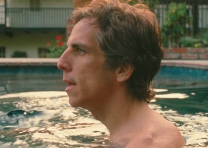
That '70s Look
This article is part of a series of interviews with leading filmmakers and craftspeople, made possible with special support by the Academy Foundation of the Academy of Motion Picture Arts and Sciences. The Academy series has so far featured Q&A's with director Noah Baumbach, production designer Rick Carter, and composer Carter Burwell.
The 1970s were a heyday not just for directors but for cinematographers. It was a time—after the lush artifice of the studio-system era, before the hyperbolic, digitally enhanced images of today—when refined cameramen like Gordon Willis, Nestor Almendros, Conrad Hall, Sven Nykvist, Vilmos Zsigmond, and Laszlo Kovacs made films of astonishing visual control that merged naturalism with stylization. Many films today, good or bad, high or low budget, feel hermetically sealed, unfolding in sterile and controlled worlds that seem removed from, well, reality. The most evocative movies of the 1970s feel like they were made by crews who took cameras out into the streets, and shot in real locations, using gradations of light as their key special effect.
This approach is being kept alive today by Harris Savides, a bearish man who is soft-spoken and modest, and is among the world's premiere cinematographers. A devoted cinephile, Savides is the direct heir to 1970s auteur cinema: both the New Hollywood of Rafelson, Pakula, and Altman, and the European cinema of Rohmer, Bergman, and Tarkovsky. The artistic offspring of Almendros and Willis, Savides combines the deceptively simple intimacy of the former (whose best work was for Rohmer, Truffaut, and Robert Benton, not to mention Days of Heaven) with the rigorous classicism of the latter (the Godfather films, Manhattan, Klute, to name a few)
Savides's success as a director of photography on music videos and commercials has afforded him the luxury of only working with directors he wants to work with. So far, that includes James Gray, Gus Van Sant, Noah Baumbach, David Fincher, and Sofia Coppola (for whom he has shot the upcoming Somewhere). It may be a coincidence, but some of his finest work has been for movies set in the 1970s, including Milk, Zodiac, and American Gangster. For Savides, the '70s lives on as a state of mind. His latest, Noah Baumbach's Greenberg is set in present-day Los Angeles, yet its purposely deglamorized photography evokes such films as Robert Altman's The Long Goodbye and Bob Rafelson's Five Easy Pieces.
Savides's artistry is a bit hard to define; he doesn't have a trademark device (although he is remarkably adept at fluid long takes). As seen below, his images reflect a nuanced, organic understanding of a wide range of influences, from cinema and photography to painting. But the basic pleasure of a Savides film is simple: his images are pure, not flamboyant. Serving the rhythms and personalities of the performers, he is an actor's best friend. He is also a filmgoer's best friend: he creates compositions that breathe, that give us the time and the space to see the world in a new light.
You have a great collaboration with Noah Baumbach; he seems like a very cerebral writer and director, but the films Greenberg and Margot at the Wedding have an organic, lived-in quality.
When I was asked to do Margot at the Wedding, he already had a good idea of what he wanted—not what he wanted the movie to specifically look like, but he wanted me to see a couple of movies that he really liked, just to get a feel for what he loves, in terms of mise-en-scène, and also the feel of the film. He introduced me to the Rohmer film La Collectionneuse.
That has great cinematography by Nestor Almendros. Was there anything specific about the film you were looking at?
I think it was just the quality. Noah just wanted to have something in his movie that harkened back to those '70s movies that Nestor shot, that one in particular. I guess it's a lack of resolution, maybe. They're not as defined as this—let's just call it the HD look that we experience now. And in some indirect way, it evokes a feeling.
So how do you achieve that feeling? Is it a combination of shooting handheld, or a certain quality of light, like gray overcast lighting. Or maybe the film stock?
I think it's a combination. I think if you were to do one thing in a big way, it would be too broad a stroke and would look like you were doing too much. But I think we did a lot of little things. We tried to use natural light when possible, used a hand-held camera, used a softer film stock. So it was just subtle degrees that accumulate into the look of the film. I tend to see things now where people do one thing, say, let's do this hand-held thing...and it just looks overly stylized.
The main thing that you feel from the film is the spontaneity of the performances. That seems to be the main goal, to let the actors do that.
We impose very little on them. The technical process doesn't interfere with the actors that much.
One scene that comes to mind as an example is the outdoor lunch in Margot, when John Turturro's character has arrived. There's so much going on in terms of family dynamic, all these strands that have been set up. And there's a beauty to the sunlight of the scene, but it's not over-emphasized.
I remember we shot with multiple cameras that day, only to try to get the performances, and to avoid cutting and restaging the same scene over and over. We might have even gone to three cameras, just to try to get the spontaneity of shooting within one take. Because each take is different and each actor's play off each other changes. When Noah works, you try to make that happen. It's all about the dialogue.
How did you approach the lighting in Margot? It's de-glamorized in a way; you've got Nicole Kidman, who is associated with beautifully lit films like Eyes Wide Shut and Birth, which had a whole different feeling.
It's always in the service of keeping it natural and simple and not over-glamorizing it, not letting the photography stand forth too much. That's all it's about, I think, for me: what looks real. And I think that's important to Noah. I think there's a certain artifice with the polished look. That works sometimes. It works a lot of the time. I certainly enjoy seeing movies that look photographically beautiful. But I think the natural approach somehow gives weight where it needs to be and things don't look overly contrived.
What about Greenberg? Were there specific 1970s films you looked at for that? Maybe also ones that were set in Los Angeles?
We looked at Robert Altman's The Long Goodbye, and Five Easy Pieces. But there's a kind of shorthand now with Noah. He'll just mention a couple of films and I kind of know what he wants to do. But I never want to ape a movie. I think it just informs us and suggests a certain vibe. You know, you can't work in a void. I certainly can't go into a project and just do what I want. So to mention those movies to me just sets the tone and the pace for the way the movie looks.
You have this great opening section, before we even meet Greenberg, a car trip through Los Angeles with Greta Gerwig's character.
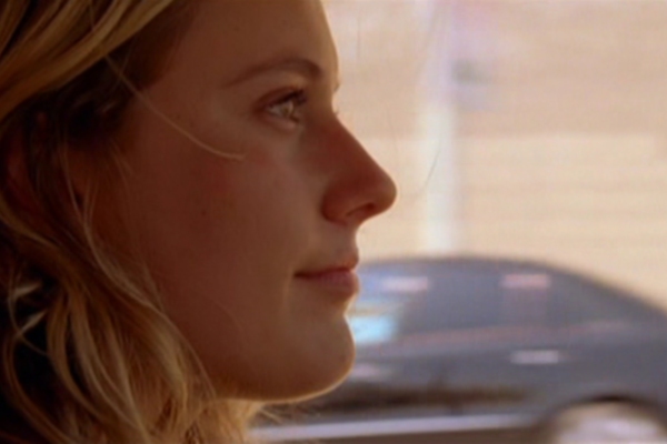
Most of the movie was already in Noah's mind, in terms of how it was going to go down and what he wanted to do. And he wanted to present her life in that title sequence: have her go to the dry cleaners, run her errands. And that was a great way to introduce her. L.A.'s a driving city; you're always in the car. The movie wasn't as handheld at Margot, but in the car, we handheld. We moved really quickly. That was the other thing. There was maybe one night of process trailer car stuff. Everything else was handheld in the car. A lot of people are working this way. The Dardennes brothers, for example, shoot movies like that. Just put two people in the car and mic it and drive off. If Noah could get in the car, it'd be great; if he can't, come back and show him.
When you say other people are shooting movies this way, it made me think of the so-called mumblecore aesthetic, which the film might suggest because of Greta Gerwig. Did you find anything in that style?
No, mumblecore's really, really, really low-fi. I think this is more like the new European style.
Or the old American style.
Exactly. László Kovács's kind of work. I feel like in Hollywood—or let's just call it in filmmaking—there's a tendency to, because you have equipment, use it. And that might not be what you need to do.
Let's talk about Birth. It's so exquisitely lit and photographed. The whole idea of looking at faces, and the mystery behind faces, is so important, because that's sort of the premise of the film: you're wondering, who is this person? I'd read that you had in mind certain paintings, in thinking about the film.
That was true of a movie I did for James Gray, The Yards. He walked me through a museum once and taught me a bunch of stuff. He wanted me to see things that he liked and appreciated, not only in regard to art, but more in regard to light and the direction of light. And it's really stuck, stayed with me.
Were there specific painters that stayed with you from that?
Yeah, Georges de la Tour, who uses a candle most of the time. And for lack of a better way to describe it, there's a kind of muddiness in the black, which is basically the fall-off of the lit part from the candle to the blackness. It's not a true black. And true black doesn't exist, really, in the world, nor does it exist in painting at all. Yet in our world, the technical world of filmmaking and video HD, black is really black now. And that seems to be the benchmark for every kind of new technology that comes along is, "Look at how good these blacks are." They're almost like anime blacks. It's very unnatural.
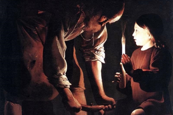
Christ in the Carpenter's Shop, by Georges de La Tour
Technicolor had that feeling, the old Technicolor. They were able to get really rich blacks.
But even there, if you go see any of these new restorations, that black still has something that's relatable in our lives, as opposed to this synthetic black that is very, very contrasty.
That murky black that you're talking about—it creates a sense of mystery?
Yeah. It's muddy black, it's purple-y black. Technically, it's wrong. But I don't want to discount the power of that in telling a story.
So that was The Yards. But do you also achieve that in Birth, that black?
Yeah, for sure. And in Birth, we kind of took it to another place. What I learned in doing The Yards I applied to that movie. With Birth, I kept asking the director, Jonathan [Glazer], to tell me what he thought he wanted the movie to look like. When we first met, he wasn't sure. And we saw a picture—it was happenstance—that the production designer had taken in his location scouting. And Jon saw it on the wall. It was one of those pictures that was almost an outtake from a roll of film. But it was beautiful. And he had tacked it to the wall.
It was just a location scout photograph?
It was a location scout picture of the lobby in the Waldorf Astoria. But it was out of focus and blurry. Jon looked at it and said, "That's Birth." And he was right. There was an ominous tone to it that seemed to be right for the story. And I set out to try to make that happen, and we kind of got that.
Very much. Stylistically, Zodiac is somewhat the opposite, because you and David Fincher had this very interesting approach of creating an almost matter-of-fact style. Which is not the usual serial killer movie approach.
I think that came from the fact that that movie was about information, and about information getting delivered and not getting delivered. And we just wanted to keep it neutral, from our point of view.
Are there specific scenes from that film that you're particularly proud of?
We weren't too showy in that movie, and that just works for the story. I was afraid the movie was going to be dull. It's long, and it's just people on the phone trying to understand why we didn't get this and why did we get that information. I do like the first killing. That was done simply. And I thought the editing was precise. It was terrifying and very well done. Car leaves, car comes back. It's a desolate parking lot. I thought we were successful in the way it looked, and also the whole blocking was done very well.
That's also a movie that referenced the 1970s. It's set in the '70s and referenced All The President's Men. And I think you've talked about Stephen Shore's photographs.
Yeah, it was the color palette from that Stephen Shore work. We looked at his book Uncommon Places and imbibed everything: the color palette that they used, the production design. And all of that stuff makes me look good, makes the photography look good. I certainly can't take credit for the look of that movie. That's, once again, all the little elements falling into place. I think the production design was unbelievable and very authentic.
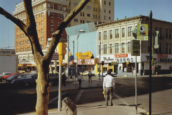
El Paso Street, El Paso, Texas July 5, 1975, by Stephen Shore
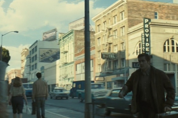
Still from Zodiac
Gus Van Sant is the director you've worked with the most. I'd love to talk about Gerry and his more experimental films.
Gerry was, for me, a really important film. It was a milestone. After working through Gerry, I felt like I understood filmmaking for the first time. In working so simply, I gained a confidence that I never had before. And that could be a factor of working for so many years. They say you don't get good at anything until about 10 years, and that was my 10-year point anyway. It's like our jobs were to get them from point A to point B and make it work narratively. And that simple problem kind of solved every problem, on every project I've done since then.
In this film, nothing else was in the way of that. It was so stripped down.
There was no coverage. There was no cutting.
So you had to be good.
Yeah. Well, it's, in certain ways, easier. I don't have to match lighting, I don't have to do elaborate lighting set-ups because we're in a scene for three or four hours and the sunlight's moving. You do a take, that take exists in the can as its own thing. So there's a certain freedom to doing that. It's in a way, the purest form of cinema. I mean, cinema does have the tenets of editing and the prowess of craftsmen who could light and make the first image look like the image they shot eight hours later. But I've found there's something really pure and enjoyable in that simple process of recording something...it just streamlined filmmaking, you know?
What was impressive about Milk was that it's a much bigger scope, but when I think of that film, I remember the quality of sunlight in apartments or offices. You and Gus were able to keep that simplicity and purity within the scope of this big film.
People always bring that up. And I think that comes from Gus's level of taste and my being able to keep things natural and simple. That always has integrity. Nothing's unmotivated. And I think after 30, 40, 70 scenes like that, the movie has a spine or a look that has a naturalness that everybody believes is real.
I guess people bring it up because that's unusual in a film that's a biopic that's going through historical events. They expect it to mythologize, so every moment is bigger than life. And this was just like life.
My favorite cinematographers have been Sven Nykvist and Nestor Almendros. Those were the people that whenever I saw their movies I thought, this is what it should be. And on the stylized front, I always liked Gordon Willis, because he took that to another level, where it was controlled naturalness. You know, heightened reality. So that's what I reach for. Everything else seems alien to me.
Willis is doing both. He's incredibly naturalistic, but also very stylized. I just looked at Klute the other day.
Oh, it's a beautiful movie. I just think he had a command over his craft. He and Sven were incredible. Where Nestor was more reacting to what was there and making it work, I think. And Sven did a lot of that; but when you look like a movie like Fanny and Alexander, you realize what an amazing technician he was.
You had mentioned a movie I was not too familiar with, Time Stands Still, as being really important to you.
Before I became a cinematographer, I went to film school, at the School of Visual Arts. And a friend turned me on to this movie called Time Stands Still, which is Hungarian, directed by Péter Gothár, shot by a young Lajos Koltai, who is now a director. He recently made Fateless. There was something about the cinematography that was beautiful, simple and just inspiring. It was aesthetically well lit, yet once again, natural. I mean, half of it is knowing what to turn off, in terms of units. There's a scene in the beginning of the movie—it's a high school dance, with all these kids—that's just so beautiful.
[Note: Time Stands Still clip has no audio and poor video quality.]
And you've mentioned the Chantal Akerman film, Jeanne Dielman.
It's an amazing movie that I was unaware of until Gus showed it to me. It was right before we went to Argentina to start shooting Gerry. He said, "I want you to see this because they don't cut often, and they come back to the same angle when they come back in a room." If you're in this room and we're talking, the camera would be there. Every time we'd come into this room, in any particular scene, the camera would still be there. So the rooms are presented from the same shot angle, height, and lens. And it plays out pretty much in real time. And he wanted me to see that it was okay that people weren't in the shot. They walked out, they came back. That was a profound experience for me. It's a powerful movie. And I think the viewer generates some of the power. After seeing it, I found cutting really disruptive to me as a viewer. It kind of stops you. If you're not cutting, you're just watching and processing.
So you've managed to find directors who let you do that. When I think of the look of Zodiac, I think of long tableau shots instead of a lot of jumping around. Of course, Gus Van Sant does that. Also Birth has a lot of very long shots.
But I'm not the one instigating it. It's funny. I'm sure I somehow—I coerce. But doesn't Woody Allen do that? Doesn't Tarkovsky do that? I mean, Edward Yang does that. I think if you could deliver that scene, that information in one take, it's easier to understand. And our jobs are to make it easy for people to understand what's going on.
I just think it's about the combination of the director and the cinematographer. With Woody Allen, I always felt like his films were better when Gordon Willis shot them.
I think Gordon mandated a certain control. And at that time, I think Woody maybe needed it, wanted it, learned from it. He's gone through that now, and I don't know how important that is to him anymore.
It might not be important to him, but it gave those films such a precision and clarity.
I think those movies were the most cinematic movies he's ever made. You know, another movie I wanted to talk about that was important to me was the opening shot of Nostalghia. It was a very simple shot. It's a wide shot of a car in a field. It's a foggy morning; I can't tell what time it is. You hear a car engine start. The car trundles across a field and it goes from camera left to camera right, clears frame and comes back in camera left, much closer. And there's something about that that just resonated with me. I thought, how come I've never seen this before?
This was before Chantal Akerman. My growth as a person has just been cause and effect or accident. It's never been a study. It's been this growth, I'll call it. And that scene and movie have been a big one for me. It's really easy and descriptive. The other thing I learned was it was a wide shot, and in the one shot, changed to a medium close-up. And actually the thing that I notice Woody Allen does a lot is he likes to start on a wide shot and have that somehow turn into a two-shot.
Woody Allen now, or from the Gordon Willis period?
The earlier Woody Allen. But I worked with him recently on Whatever Works, and he would've liked to have been able to do that. But there were circumstances beyond our control. I know he wanted to try to do that. Like have them come in, we see the room and we understand where we are, and then they end up talking, two-shot. Which Bergman does, too.
But he was not able to do it as much as he wanted or—?
Sometimes there are performance issues that you must cut around.
Okay. Got it, enough said about that. It feels like when we talk about 1970s films, that seemed like a great period for cinematographers. I mean there's Conrad Hall, you mentioned László Kovács. What was different then in terms of the cinematographer's craft?
Well, it wasn't just the cinematographers. I think it was the directors. What do they call the 1970s? The auteur period? So it was the directors, probably the producers. Everything was different then. And you got to make your movie. Whereas now, at least in the mainstream, movies are made to satisfy certain demographics. And that imposes certain creative devices.
You've been able find directors to work with who try to keep auteur cinema alive.
I know. And not consciously. I haven't been looking for that; it just happened. In fact, after doing American Gangster and Zodiac and Milk, I said I don't want to do another 1970s movie!
What was American Gangster like to shoot?
It was good. It was interesting. It was fun. I haven't done a big movie since Zodiac. But it was a big movie. Ridley likes to use a lot of cameras, which I wasn't used to. And I had to work with that. I feel like a director has the right to work any way he wants and especially Ridley has the privilege to demand. So it was very difficult to work that way and make it look good. From a technical point of view, it's hard to shoot different angles. There's a certain compromise. Second camera calls for compromises; third camera makes more compromises; fourth and fifth camera are more compromised. But it seemed to work with that energy of that movie.
Are there directors you hope to work with?
Yes. I would love to work with Ang Lee. I'd love to work with Fatih Akin. I really like Edge of Heaven. I like Michael Winterbottom. I like Ken Loach, Mike Leigh. There's a lot of people I'd like to work with. Alfonso Cuarón. I think he's a really amazing director—it seems to me he's a chameleon.
I'm curious about commercial work for you, how that feeds into your feature work. There's a long tradition of that. I know Conrad Hall and Haskell Wexler had a commercial company.
I'm so lucky that I have my foot in both worlds, because I need to make a living. And it gives me the freedom not to take a movie that I may not want to do. And after the 1970s, I think commercials and music videos were the only real experimental places we had to fool around and try new things that were purely visual. I learned a lot in that world. And I still do, because I'm trying stuff that I may or may not use on a narrative, where you have to hone a design down. Once you start shooting, you don't change it. So you're doing that one thing for two or three months.
Some of those music videos you shot for Mark Romanek are amazing.
It was funny because that was a big period for me, where it was all about the cinematography. And I learned so much because of that. Whereas now, I know that making a movie is really not about cinematography. It is, but it's more about the story.
Do you have a favorite music video?
I have a couple. I did a Tom Waits music video for an album called Bone Machine that I like very much. One take. It's just this nice experiment. And I really like what we did on this Nine Inch Nails thing for Closer. I'd like to do them again. It's just I think the whole business changed.
You turn on MTV and get a reality show.
I think the budgets fell apart. I seem to be lucky....I mean, the work I got is because of that stuff.
The feature work is because of the music videos?
Yeah. It must've been.
What was your first feature?
It was a feature with Alec Baldwin in it, called Heaven's Prisoners. And there was actually a movie before that, that I kind of want to forget. It was for Zalman King's company, it was called Lake Consequence. And you know, God bless him, he gave a lot of young cinematographers a start in movies. They had asked me to do a movie maybe three months after starting to work all the time in commercials. And I was like, "Sure, I'll do a movie." I mean, I'd never been on a real set before, and I got to shoot a movie. But they wanted people who were doing stylized work, like beautiful beauty, you know, high end music videos, slick stuff, to work for them because what they did was pretty much this very soft, soft porn. David Duchovny did those shows.
So it was like a Roger Corman studio for the times.
Definitely, because all the DPs who I admired who were coming up, had just done one of those movies.
Right. And you want to be good enough to never have to do another one.
Certainly. And it's a great place to learn what not to do. But man, it was boot camp. ![]()
LATEST ARTICLES
-20140814-173707-thumb3.jpg)
Fighting Words
by Imogen Sara Smith
posted August 12, 2014

Fighting Words, Part 2
by Imogen Sara Smith
posted August 20, 2014

On the Margins: The Fil…
by Andrew Chan
posted August 12, 2014

Robin Williams: A Sense…
by David Schwartz
posted August 12, 2014
 That '70s Look
 Birth
Birth
 Gerry
Gerry
 Margot at the Wedding: lunch
 Milk
Milk
 Nostalghia
 Time Stands Still
 The Yards
 Zodiac
KEYWORDS
interview | Academy Foundation | Harris Savides | Noah Baumbach | Greenberg | New Hollywood | cinematographer | realism | James Gray | David Fincher | Gus Van Sant | music video | Gordon WillisTHE AUTHOR
David Schwartz is the Chief Curator at the Museum of the Moving Image. He is also a Visiting Assistant Professor in Cinema Studies at Purchase College.
More articles by David Schwartz
